Liquid Glass in the Wild
2025/09/24 #uiuxWhen Apple unveiled its new design language Liquid Glass at WWDC this year, many people argued it would be largely ignored by big third-party developers. After all, most of those developers (read: major companies) already have their own well-established design systems that they try to use across platforms like the web, Android, and Windows. So why would they suddenly conform to Apple’s new Liquid Glass-aesthetic?
That assumption wasn't entirely wrong. Even Apple’s own pro apps — like Final Cut Pro and Logic — are sticking to their established look and feel (at least for now). Given the complexity of their interfaces and the need to keep long-time professional users in a familiar environment that makes a lot of sense.
However, a bit more than one week after the release of the new "26" operating systems (iOS, iPadOS, macOS, watchOS and tvOS) we’re already seeing some big early adopters of Liquid Glass. And while the overall adoption is definitely still in its very early stages, it’s interesting to see some apps are already leaning in early. Here's a list of a few interesting examples I have found so far:
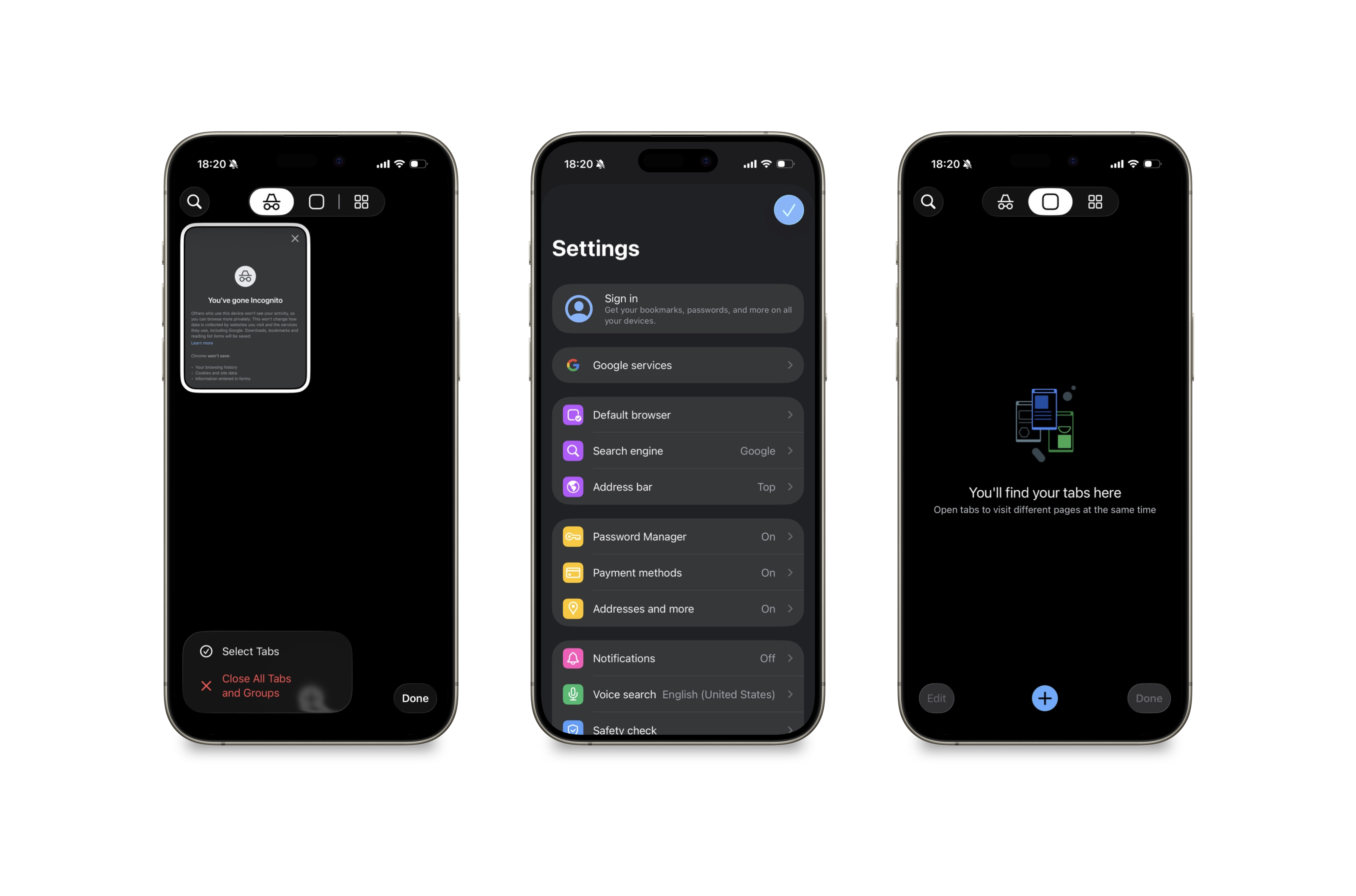
Chrome
Let's start this with the biggest surprise of them all. Google Chrome has integrated Liquid Glass elements very cautiously so far. That being said, any adoption of Liquid Glass is news here as most of Google's apps like GoogleMaps, Gmail and so on tend to stick to their own design systems.
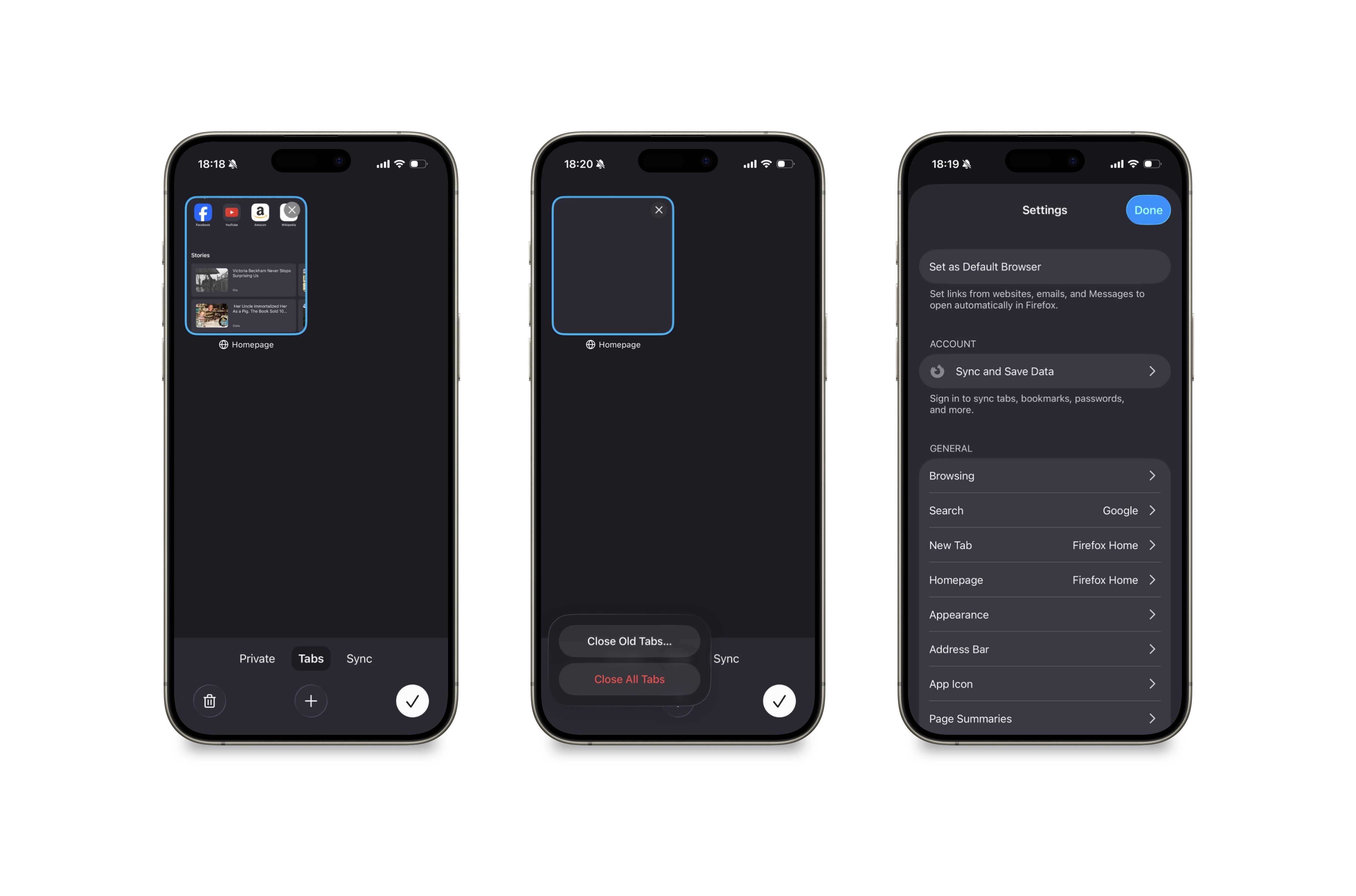
Firefox
The next browser adopting Liquid Glass is Firefox. It's at a very similar stage as Google Chrome with just the main buttons and menus having changed so far.
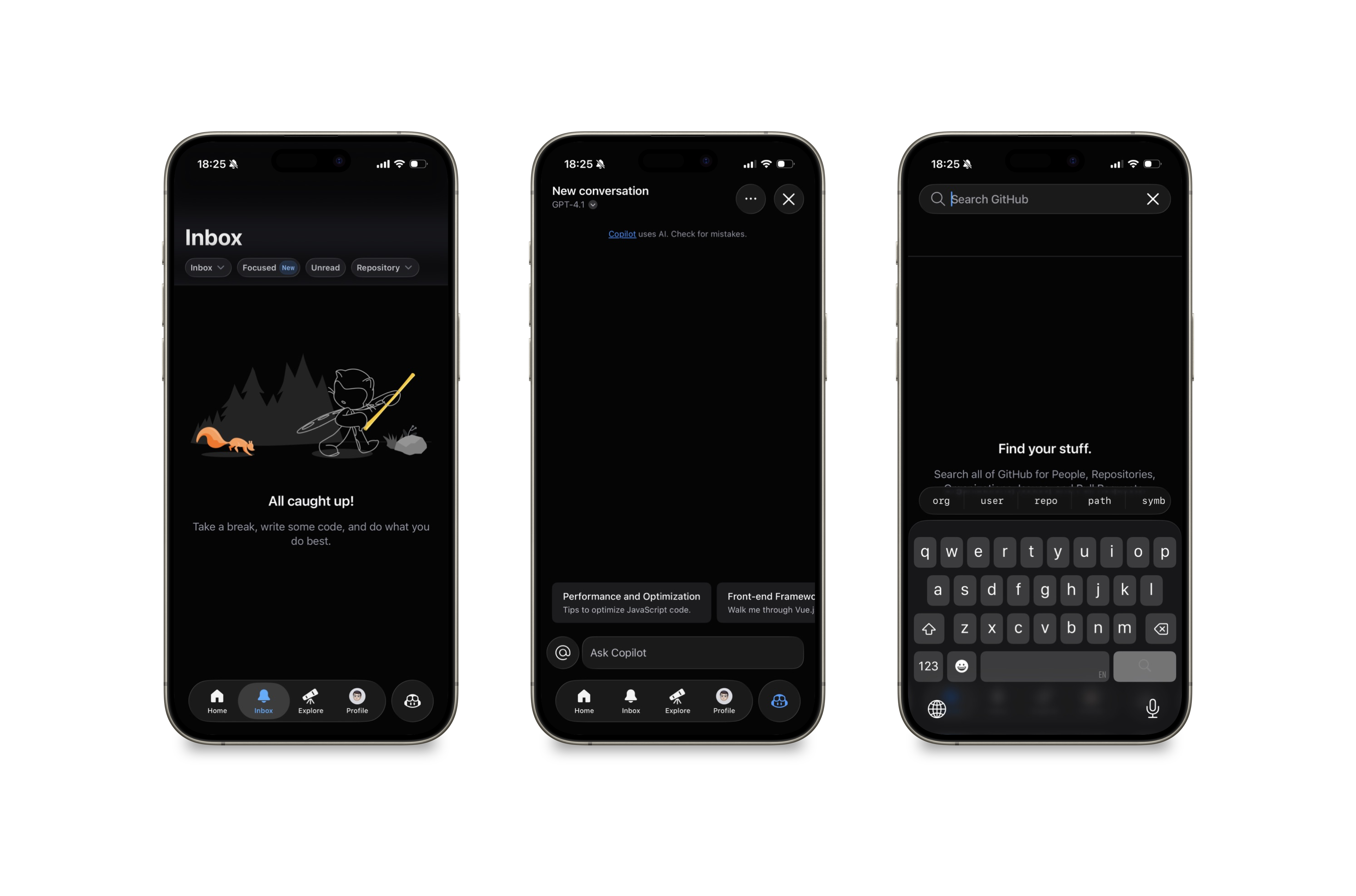
GitHub
GitHub’s iOS app has fully embraced the new floating tab bar style introduced with Liquid Glass. Notice the prominent Copilot button right of the tab bar.
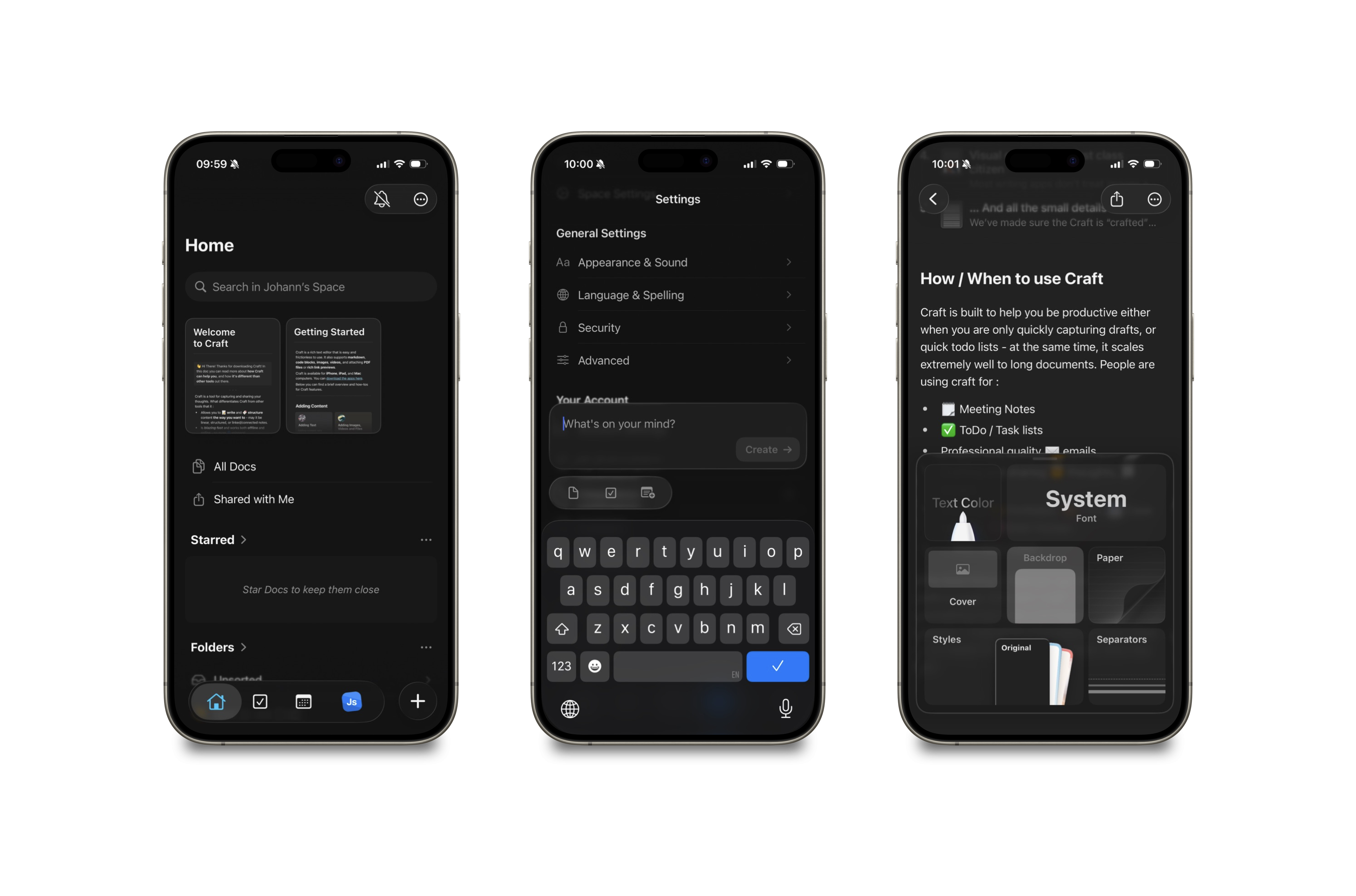
Craft
Craft embraces Liquid Glass fully and also plays with translucency, glass materials and so on in custom views throughout the entire app. It also uses the new floating tab bar style.
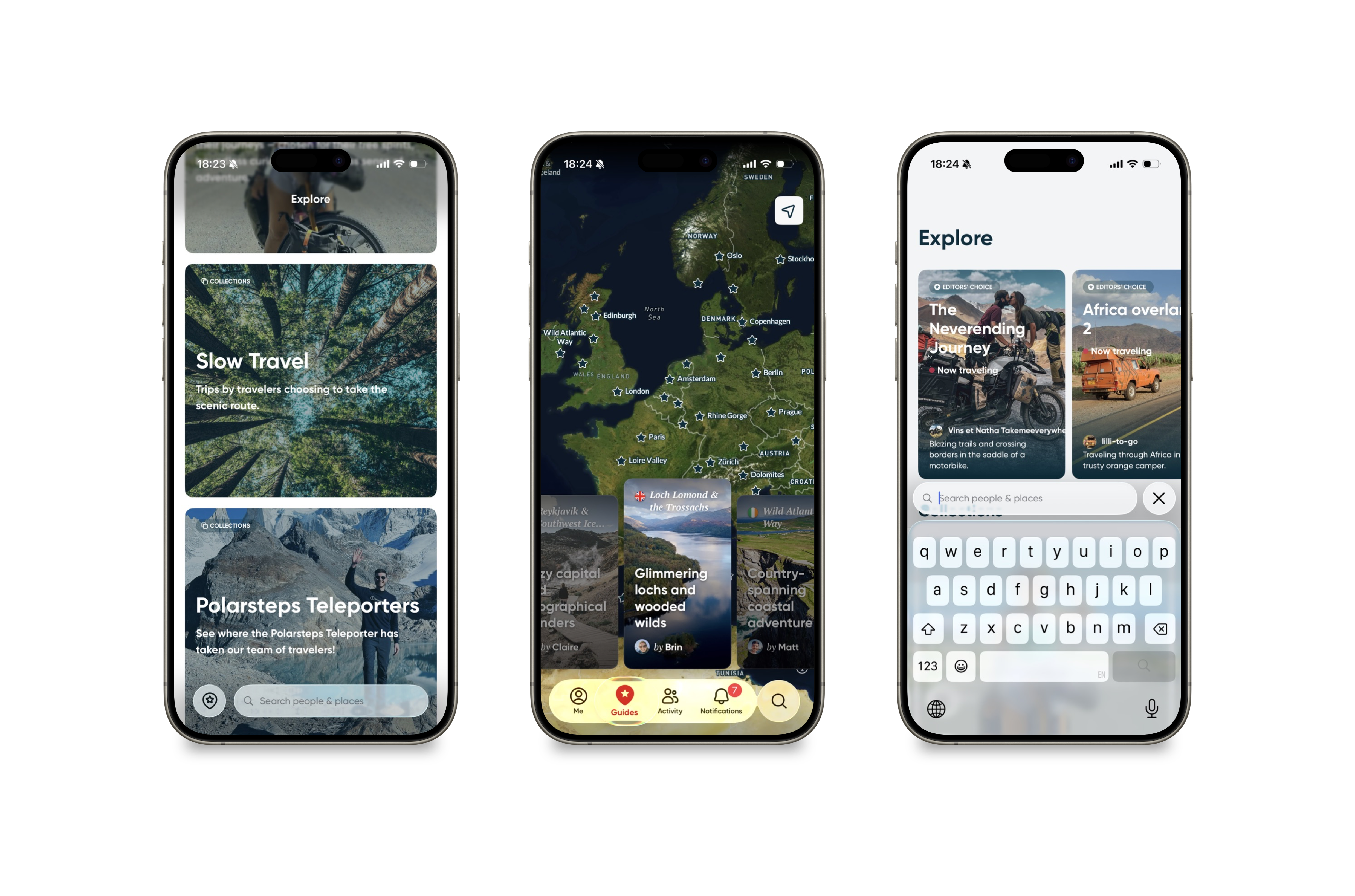
Polarsteps
The travel journal app Polarsteps also uses the new floating tab bar style prominently, including the included native search bar.
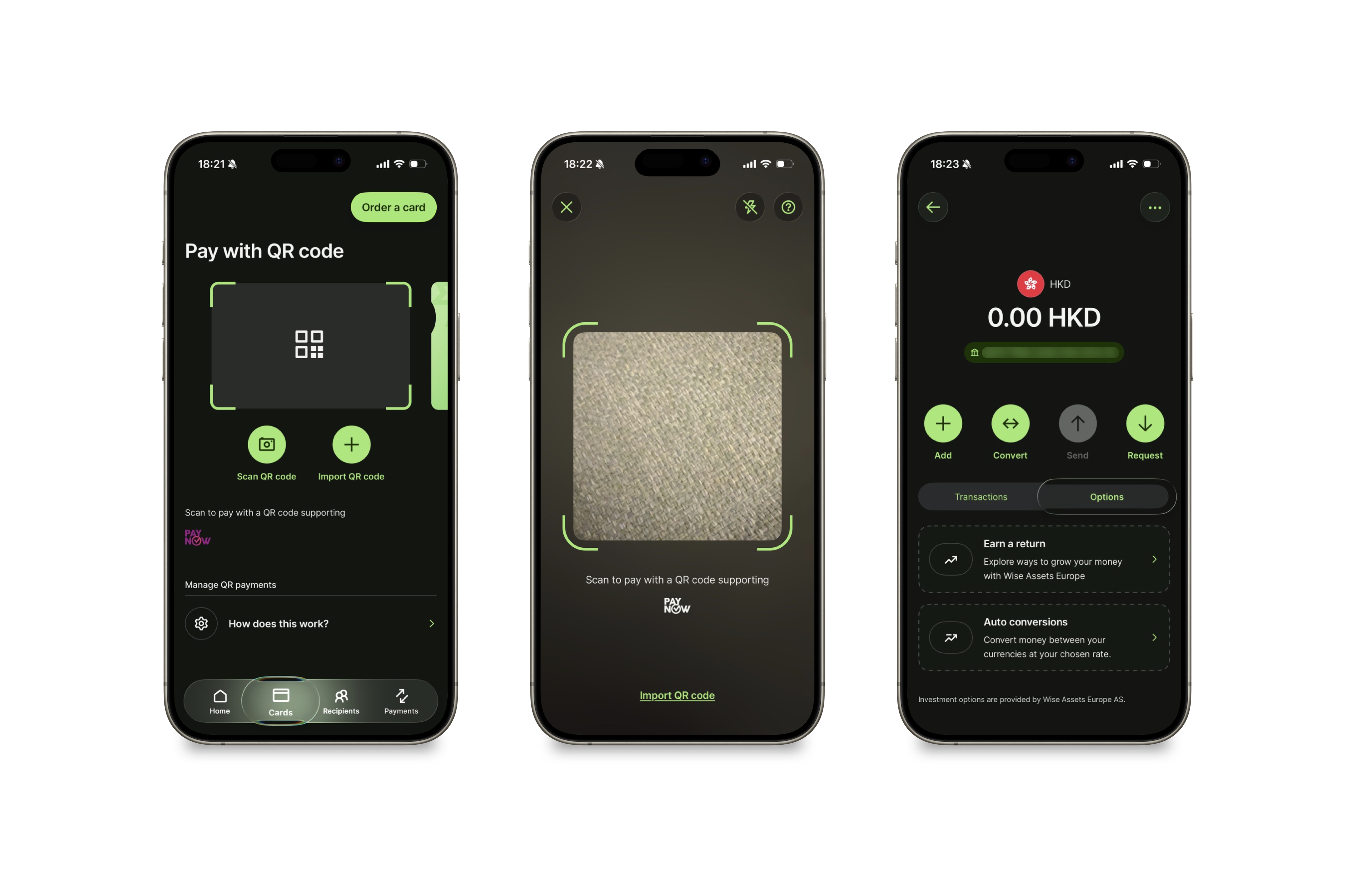
Wise
Even some banking apps have started experimenting with Liquid Glass. Wise is using the new floating tab bar but with more opacity. In general they seem to be using the new aesthetic sparingly but effectively.
One to Watch: MLB
A particularly interesting case is the MLB app. It has a reputation for being a good iOS “platform citizen,” staying current with Apple’s latest design and system features. That’s why I’m especially curious to see how it implements Liquid Glass. I expect this one to update at some point after the end of the current season so it may take until next year realistically.
It's early days still
It’s still very early days for Liquid Glass but I have to say I am quite bullish on how fast and wide an adoption it will see. I think it’s worth keeping an eye on how these early examples evolve, because they’ll likely influence the next wave of adoption. In my next post I plan to take a look at some of the best indie app implementations of Liquid Glass. Stay tuned!