Liquid Glass in the Wild: Indie Apps
2025/09/25 #uiuxAfter looking at some big third-party apps experimenting with Apple’s new Liquid Glass design language in their UI, I wanted to dedicate a follow-up post to a few indie developers. Indie apps are usually more willing to embrace new platform conventions early so I was excited to see what ideas they have already had the chance to implement over the summer. Here are some standout examples:
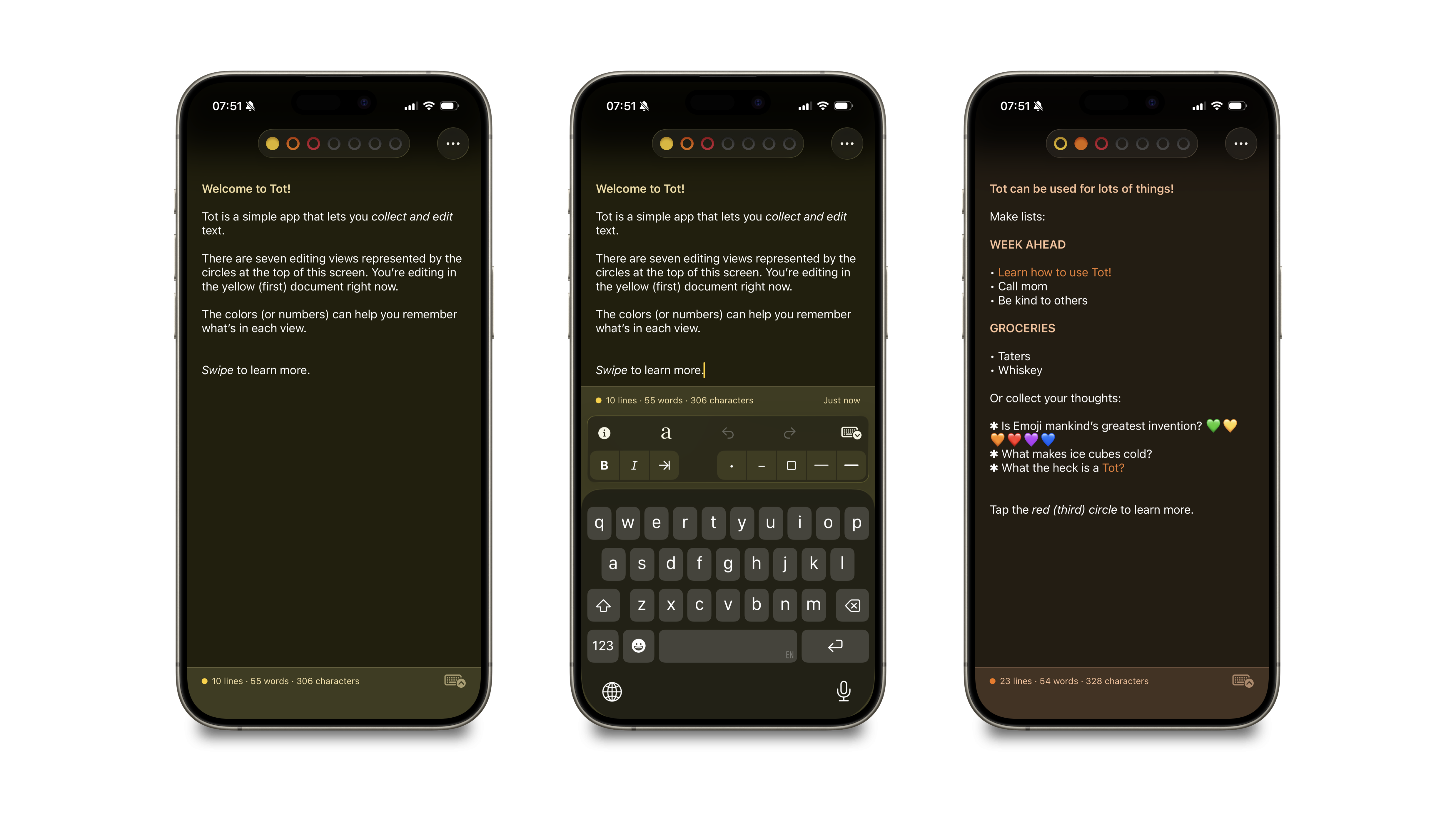
Tot (by Iconfactory)
Tot is a deceptively simple app: just seven small text documents you can use to capture notes, snippets, and ideas. Iconfactory has given Tot a subtle Liquid Glass refresh that feels completely at home on iOS 26. The subtle glass accents make the minimal interface feel a bit more fun, while still keeping focus on your text.
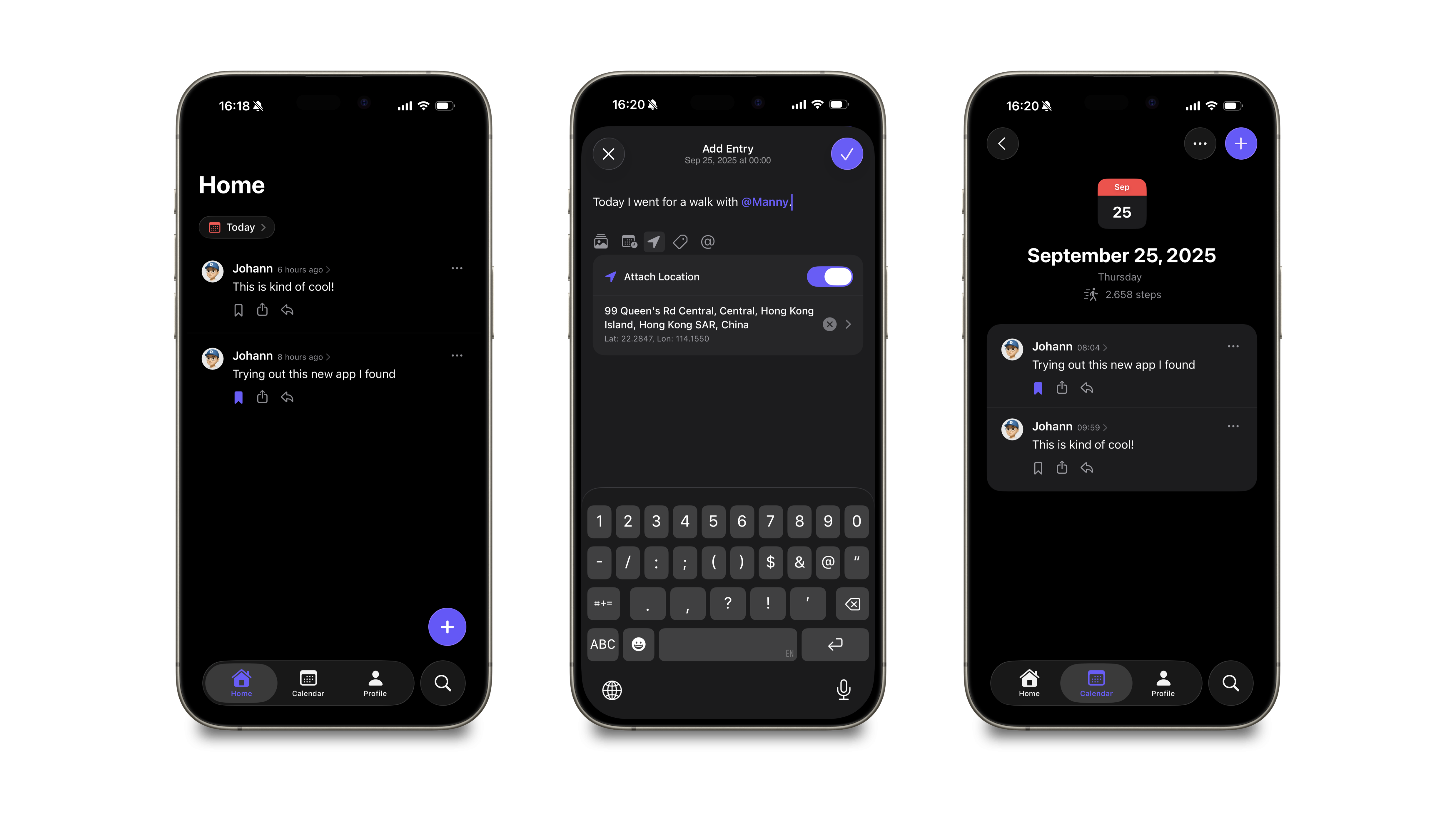
Zeitgeist (by Marcel Wichmann)
Zeitgeist is a brand-new app experimenting with the concept of private micro blogging. It uses the new tab bar style and adds a floating action button on top of the separate search button on the right side of the screen. It's an exciting example of how a fresh indie idea can also showcase Apple’s latest design work by keeping design to a minimum.
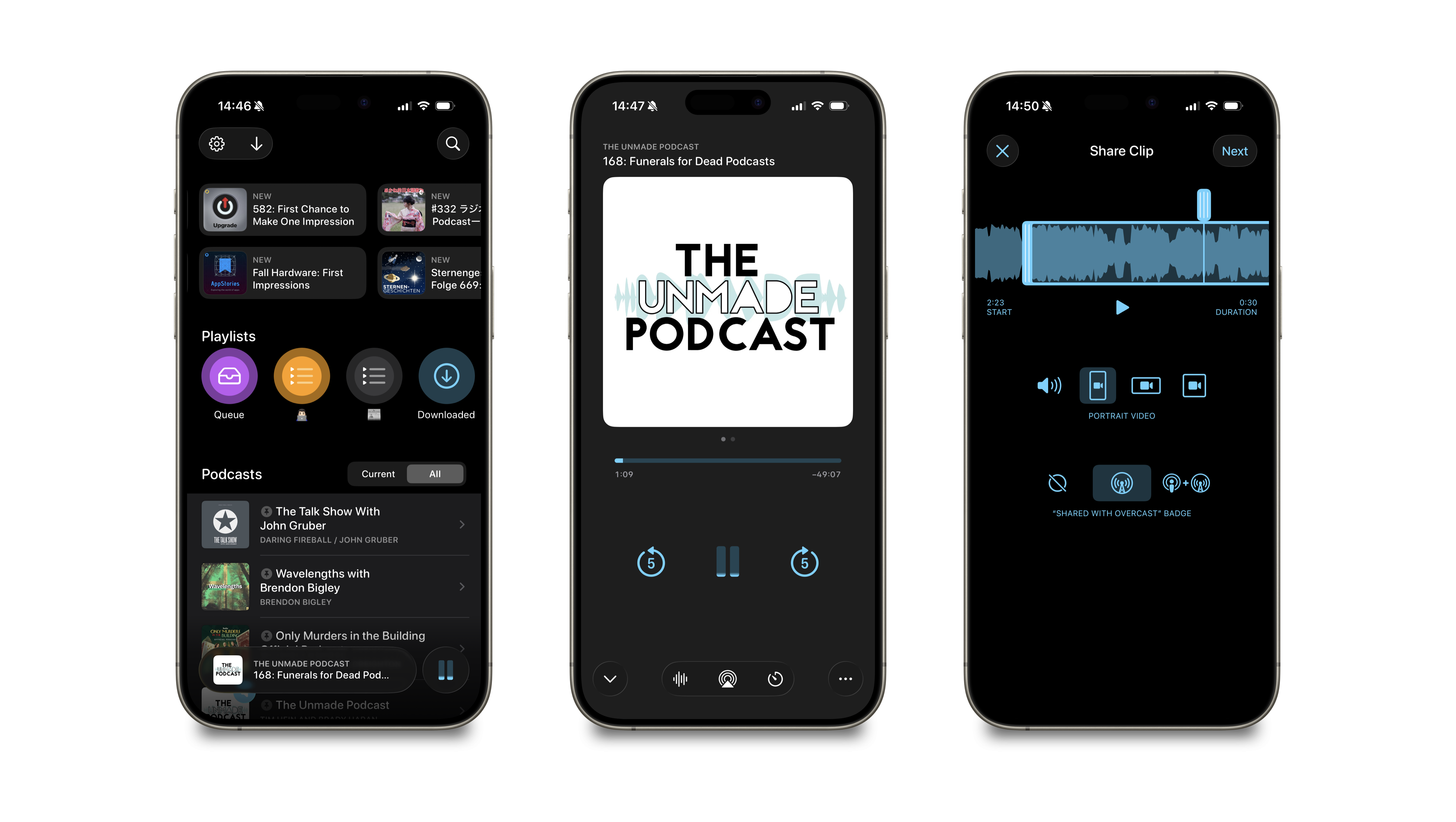
Overcast (by Marco Arment)
The podcast client Overcast is one of the classic indie apps on iOS, and Marco Arment (of ATP- and Under the Radar-fame) has consistently kept it modern without ever chasing trends. The addition of Liquid Glass here is subtle but effective. I especially like that Marco decided to implement a custom built floating "Playing now"-bar instead of relying on the new and still buggy tab bar accessory Apple provides natively with iOS 26. This shows what's possible when you want to build something custom with Liquid Glass.
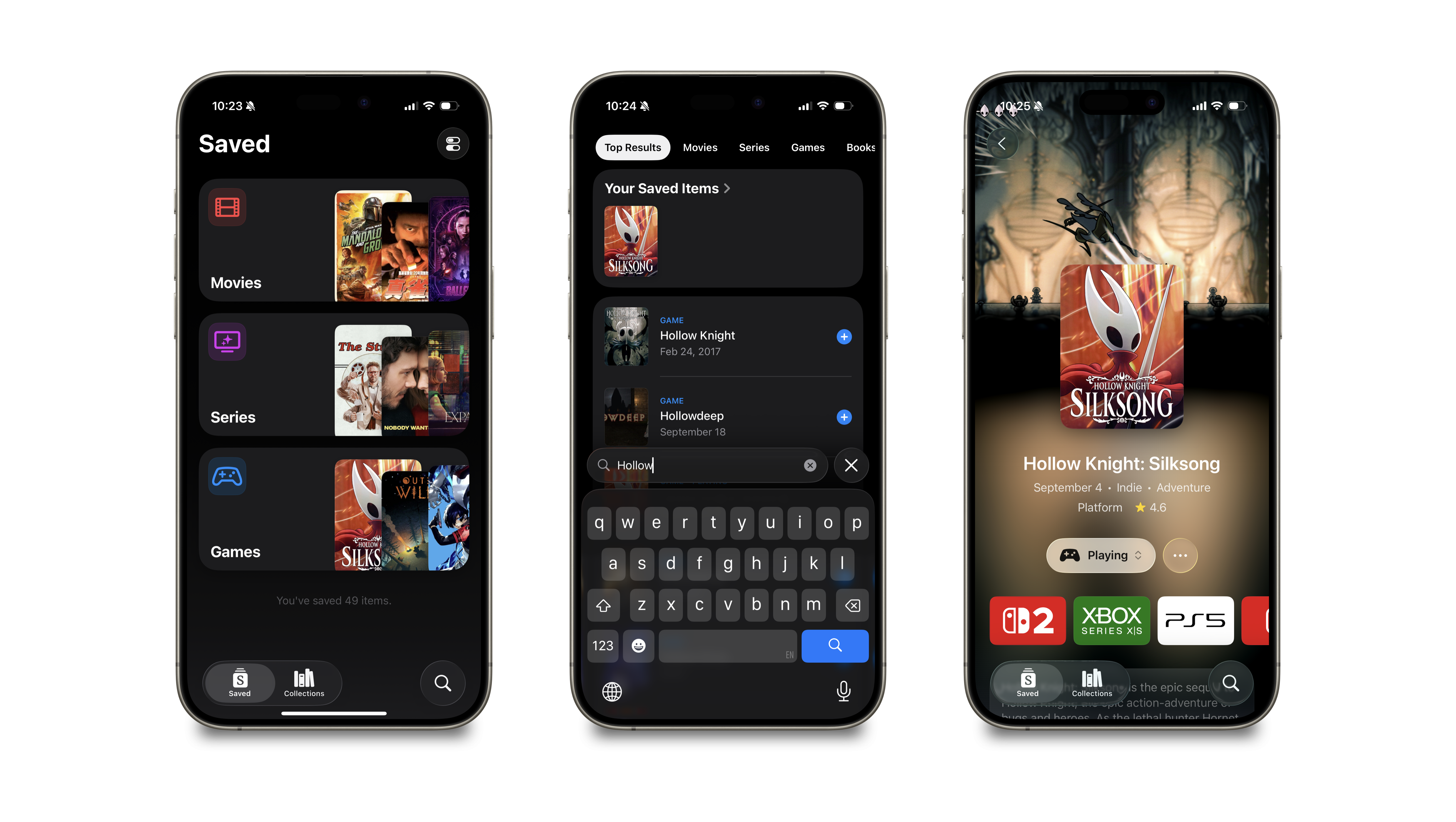
Sequel (by Romain Lefebvre)
Sequel is a popular media tracker for movies, TV shows, books, and games. Its new Liquid Glass integration adds polish to an already well-designed interface. It’s a good example of how translucency can support, rather than distract from, rich content.
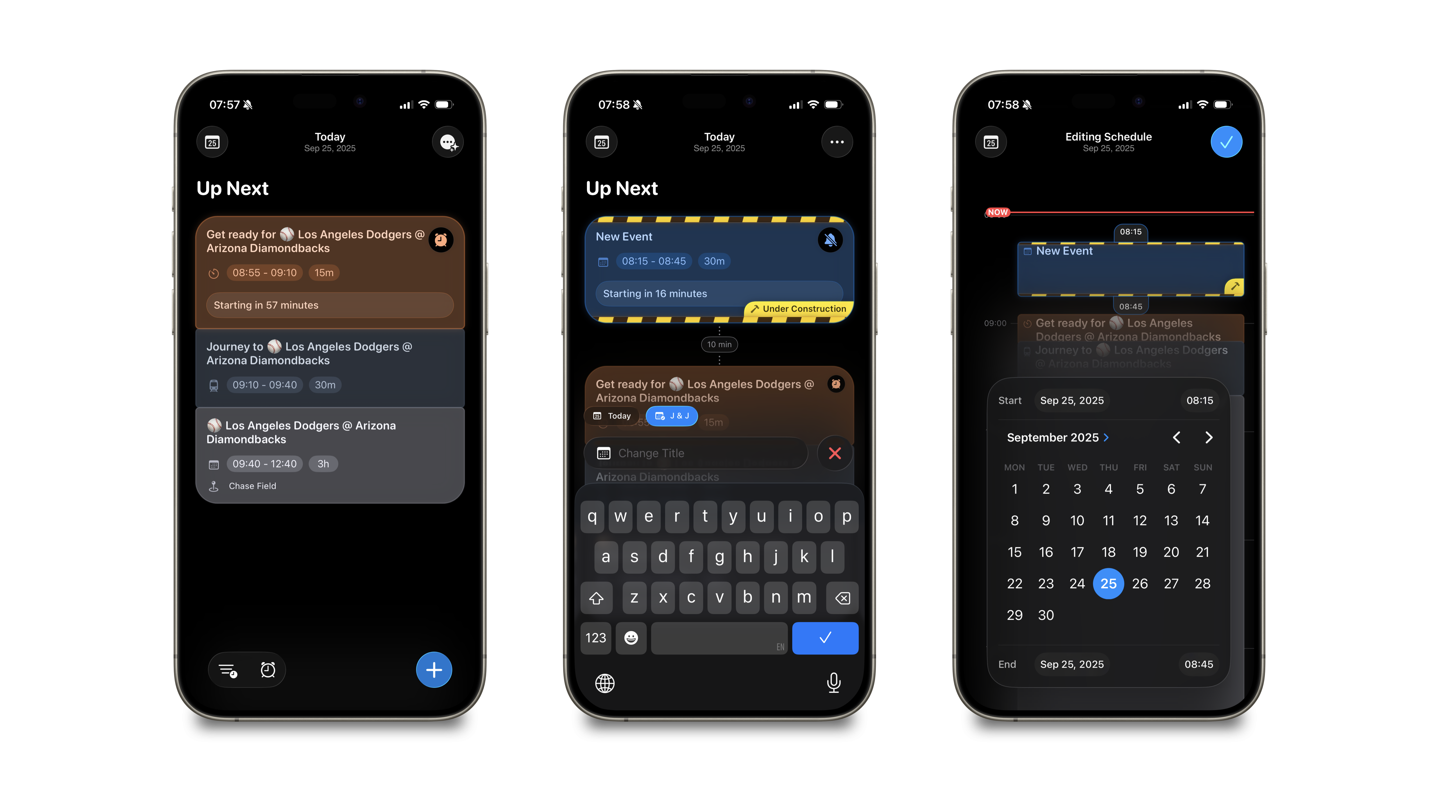
Daylish (by Manuel Kehl)
Daylish is a brand-new day planner using the new Alarms API. It uses Liquid Glass from the ground up, with translucent panels that give the daily view a fresh, airy feel. For an app designed around planning and time, the new design language adds just the right touch of calm.
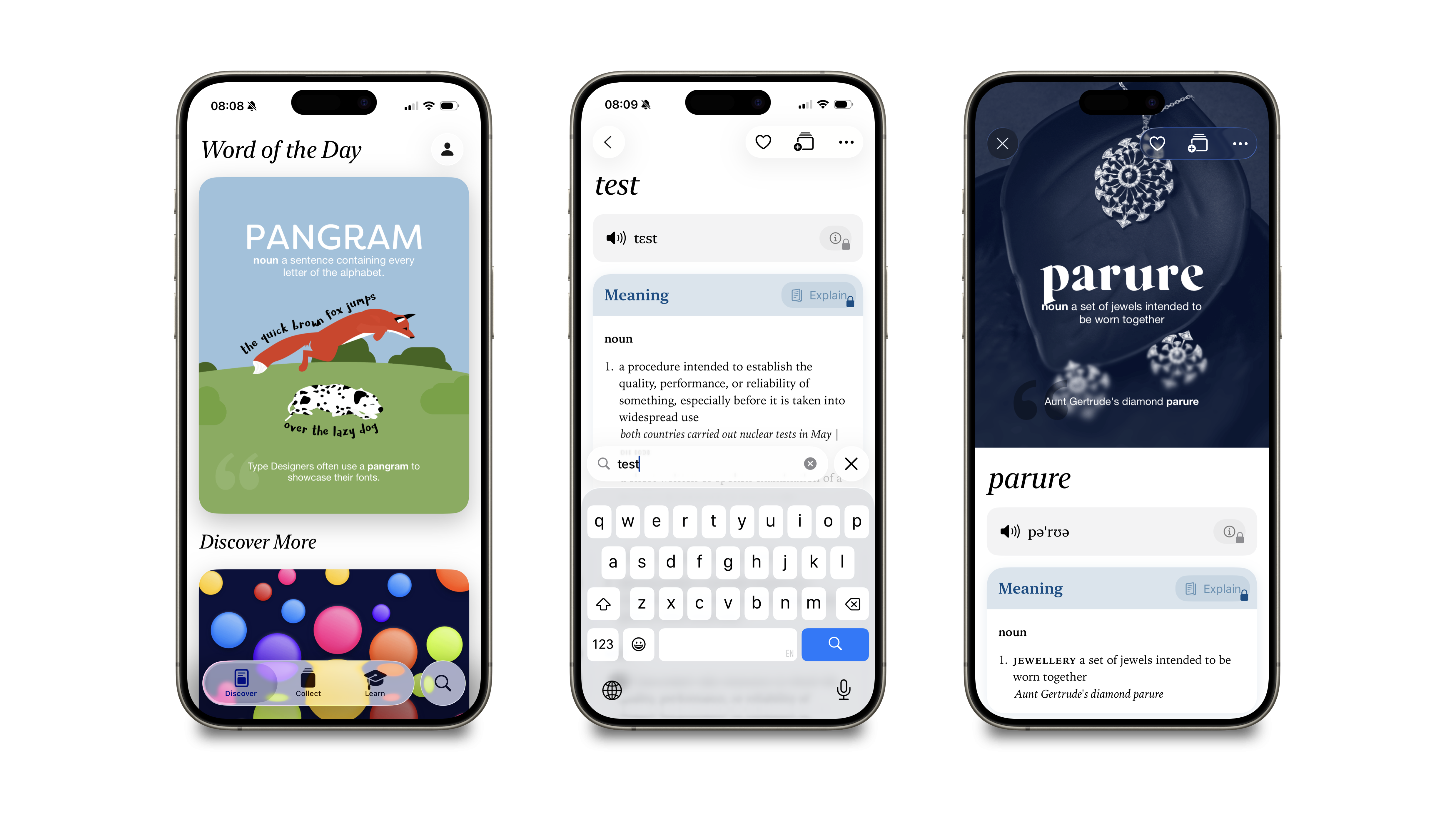
LookUp (by Vidit Bhargava)
LookUp has been around since 2014 and has seen multiple careful redesigns over the years. Vidit Bhargava’s attention to detail shows once again in the latest update: Liquid Glass is integrated beautifully into the dictionary browsing experience, making the app feel both modern and timeless.
Wrapping up
It’s no surprise that indie developers are among the first to experiment with Liquid Glass. They’re closer to the platform, can move more quickly, and often see the design of their apps as a key differentiator. What’s especially exciting is to see the variety in how each of these apps applies Apple’s new design language. To me this proves that Liquid Glass isn’t just a new coat of paint — it’s a flexible set of tools that can adapt to different app personalities.